Good News Bad News
Mobile devices and online learning are commonplace across learning institutions. Unless your institution records (and shares!) metrics about device usage, you probably have no idea how many of your students are using mobile devices to access your course.
The bad news is that mobile students are not offered the same experience as students who use desktop computers or laptops. The good news is that tools are available to help usher a better experience to the student using mobile devices.
The width of mobile devices is much smaller than a typical computer, so content is displayed differently. Most learning management systems will manage the content automatically, so the content will look good both on a big monitor and a small phone screen (this is called responsive design). However, there are a few basic design principles that you can do that will make the experience better for the students.
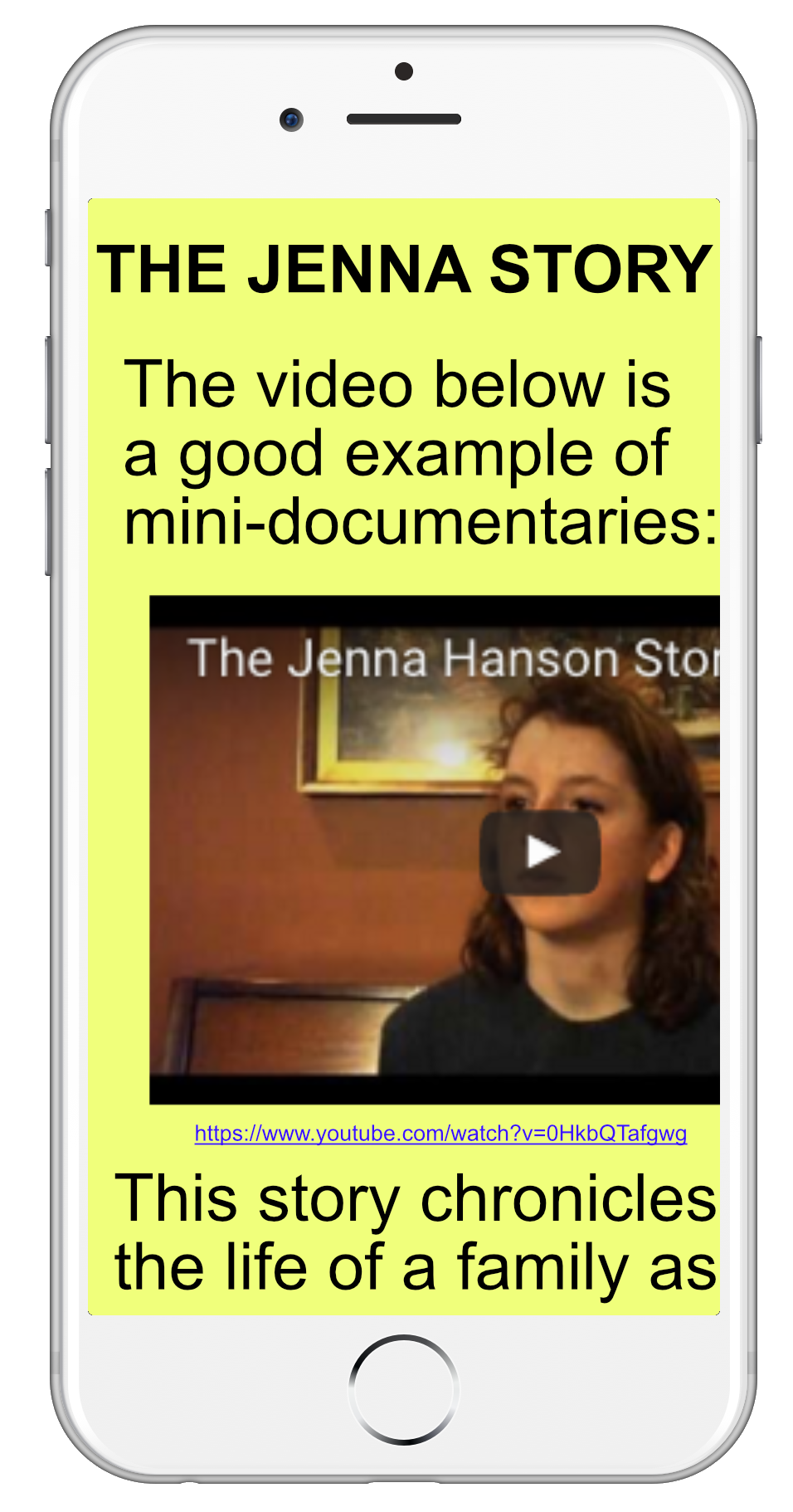
Provide hyperlinks for embedded content.
If any content is embedded into the LMS (for instance, YouTube videos), it is good to also provide the link to the content. Some objects, when embedded, can look awkward on mobile devices. Having a link to click on – the source of the embedded object – enables the mobile student to click on the link and visit the original content (where it may look better on mobile devices). Note that embedding content is still appropriate! It streamlines the experience for the student and also helps to minimize distractions.
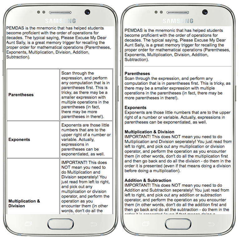
Use simple design – avoid tables and deep indents.
When possible, avoid tables. Not only are tables inefficient with space on smaller screens, but tables are cumbersome from an accessibility standpoint, too. Instead, try using headings to separate paragraphs:
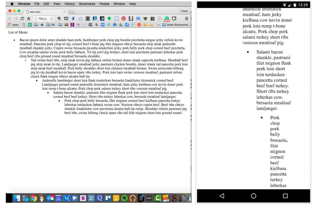
The same is true for bullet points – every indent on a mobile screen incurs a massive penalty for real estate. If you find it necessary to have multiple levels in a bulleted list, consider an alternative such as leveraging headings or using one level of bullet points with multiple paragraphs for each one.
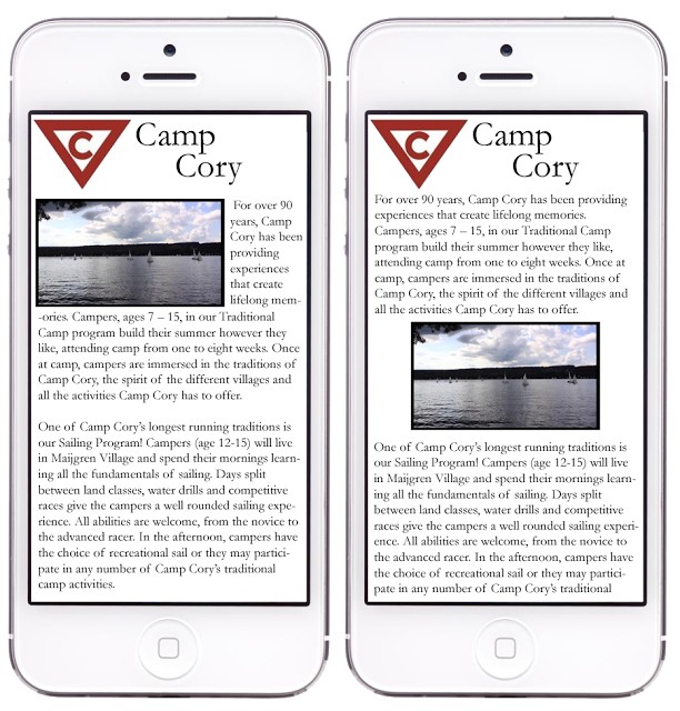
When inserting images, avoid putting text to the left or right of the images.
On small screens, putting text next to an image creates a fragmented reading experience. Because the space for words can be extremely small, there may be only one word per line. In some cases, one word may be hyphenated and take up multiple lines of text. Depending on how the justification is formatted, the spacing between letters may be abnormally large and be inconsistent from word to word.
Percentage vs. pixel (tables, images)
Many learning management systems will allow you to specify the width of objects (like tables and images). Depending on the object, you can provide a width in either pixels or percentage. When given the opportunity, choose percentage. A table that is 700 pixels wide may spill off the side of a screen that is only 400 pixels wide, and the user will have to scroll to see some of the data. However, if the table width is specified in percentage (for instance, “100%”), then the table will take up 100% of the screen on whichever device is being used.
Test the course on multiple devices.
The absolute best way to ensure that mobile learners can apprehend the content properly is to test it across multiple devices. Ideally, testing it on multiple browsers on multiple devices is the best way to see if the content renders nicely. However, this can be time consuming and costly. If you have a tablet or smartphone, you can use those to test some of the content that you might think will be problematic. You can also talk to your students; opening a line of communication with them to get feedback on the mechanics of a course can provide great insight (and free testing!).
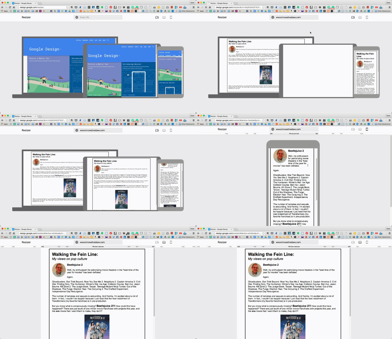
There are a few tools you can use to help see what a webpage looks like on other devices. One of the easiest is the Google Resizer. Simply go to design.google.com/resizer and type in the URL of the page you want to test. You can see the page as it looks on different devices (including portrait and landscape).
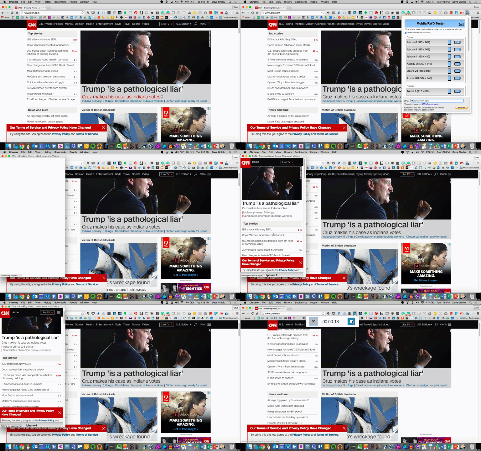
Alternatively, there are extensions for web browsers that will emulate the display on other mobile devices (such as Mobile/Responsive Web Design Tester and Ripple – both for Chrome) that give good approximations for how content will look on different mobile devices.
If specific mobile apps are appropriate for the course, articulate which apps students must have, and ensure that students have access to them on any of their devices.
Apps are a nice option for students, because they can provide a better experience for learning.There are a few things to consider before requiring students to use apps.
If students need to have access to specific apps to participate in the course, then those apps need to be available across all mobile platforms (for instance, some apps are only available in the iTunes store, which would maroon Android users).Students need to be aware of any apps before the semester starts, as well as any associated costs.
Privacy is a concern with apps; if students are required to use apps, and those apps need access to personal information, then the student should be made aware of this and also be provided an avenue to use if they are uncomfortable with giving personal information to third parties. Understanding what information and services an app has can be tricky – some operating systems (such as iOS) do not explicitly tell the user what data and services the app has access to. Other platforms – such as Android – prompt the user with an itemized list of permissions (and lets them accept or decline each individual permission).
Accessibility is a tremendously important concern as well. If students are required to use an app, then that app must be accessible by students with disabilities. Coordinate with the accessibility compliance officer at your institution if you have any questions.
Avoid content that relies on technologies that mobile devices cannot use.
Older (and less secure) technologies such as Adobe Flash, Microsoft Silverlight, and Java are not usable by many mobile devices. Any content that is provided in those formats should not be used. This may be tricky because publishers may not have completely converted their content to modern standards. Consider working with an instructional designer if you need help discovering content that is acceptable.
If file attachments are necessary, use a PDF if possible.
Generally speaking, it is best to avoid attachments if possible. For example, if the only point that a Microsoft Word document serves is to give information, that content would be better placed as a page in the LMS. However, there are times when attachments are necessary; in these cases, a PDF is the best option (because it typically does not need special software to open it). Specialized files, like Word, Excel, and PowerPoint require individual apps. This leads to a piecewise experience for the student, and may produce a barrier for the student (if they are unable to install apps on their mobile device, for instance). There are notable exceptions to this guideline – some classes (like accounting courses) may require students to interact with an Excel spreadsheet. In these cases, the specialized files must be attached.
Remember that mobile learning implies small, episodic bursts of learning – bundle content into smaller, manageable chunks.
If content in your course is lengthy, consider breaking it apart into multiple sections. If a student starts to read content on a desktop and leaves, it is fairly easy to pick up where they left off. On a mobile device, picking up where you left off in a large pool of text is trickier. Being aware of this and parsing the content into manageable components helps mobile students keep track of their progress.
