
Back-to-School with Brightspace
If you are teaching at a SUNY then chances are you are using Brightspace or are about to switch to this new LMS. I will show you a few options for your Brightspace courses that I use (a lot) and hope it benefits you and your students!
First from an instructor perspective it is handy to know ways to input due dates for your assignments. There is more than one method to enter due dates in Brightspace but one of my favorite features of this LMS is how quickly I can manage the dates of all assignments. When you end up teaching the same course in a future semester this will come in handy because you will have a new date and can change them all in one shot.
While there are a few ways to do this, I go to the course and find where it says Course Tools on the navbar (on top of the course site) then click on Course Admin.
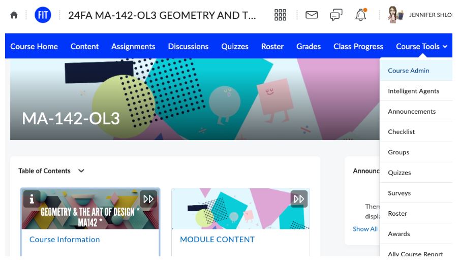
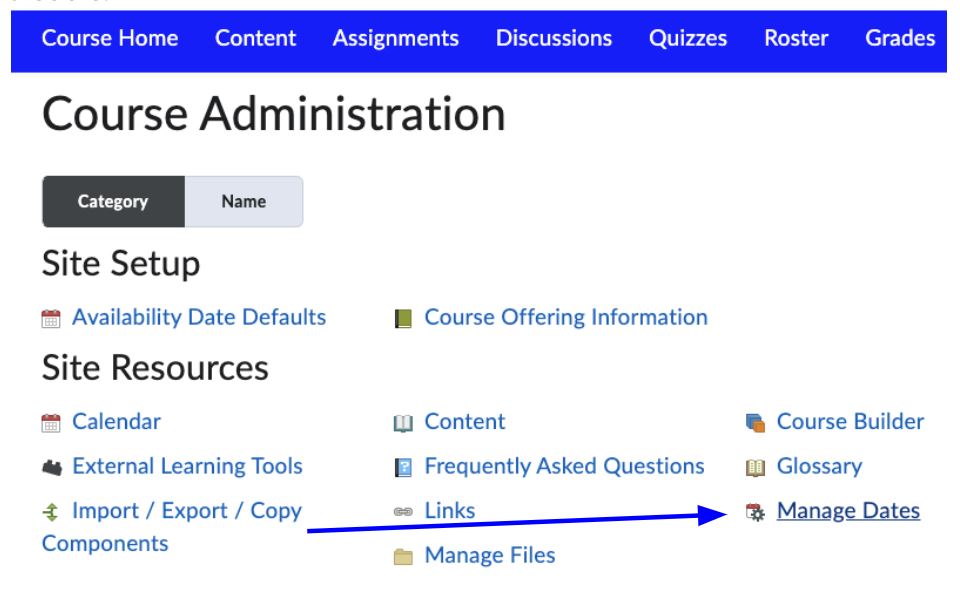
From the Course Admin area you click on Manage Dates. This may look a bit different in terms of the location of “Manage Dates” on your site but you can always do a search for the term to find it if you are having trouble.
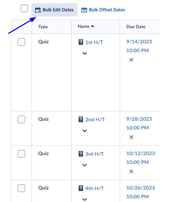
Once you get to Manage Dates there are options and filters to help you narrow down what exactly you want to see. I used the filter to see Quizzes and once it displays the items you have the Bulk Edit Dates feature.
Now for something that is fun for both you and your students. If you have seen inside my courses then you’re familiar with how I enjoy creating a unique experience for each of my classes and incorporating a variety of tools that add personalization (and pizazz)! That has not changed with the switch to Brightspace. I still use Adobe Express, Bitmoji, and Animaker to name a few. If you have some time to play around with these free tools then you can transform your site into something you will love to look at and I believe your students will too!
There are plenty of banners and images to choose from in Brightspace for the banner, the table of contents, the html pages, and more areas on your course site. So, if you find what’s already on the site to your liking then great but you still may want to check out Adobe Express. In a few minutes you can be creating a graphic that works even better than the options given.
Here are a few examples of incorporating Adobe Express in Brightspace:
- I use web pages that embed throughout all the courses as images. When you click on the image it brings you to a web page. Whenever I do this I also have the same information lower on the site broken down piece by piece without any images in case students prefer a simpler way to view the information.
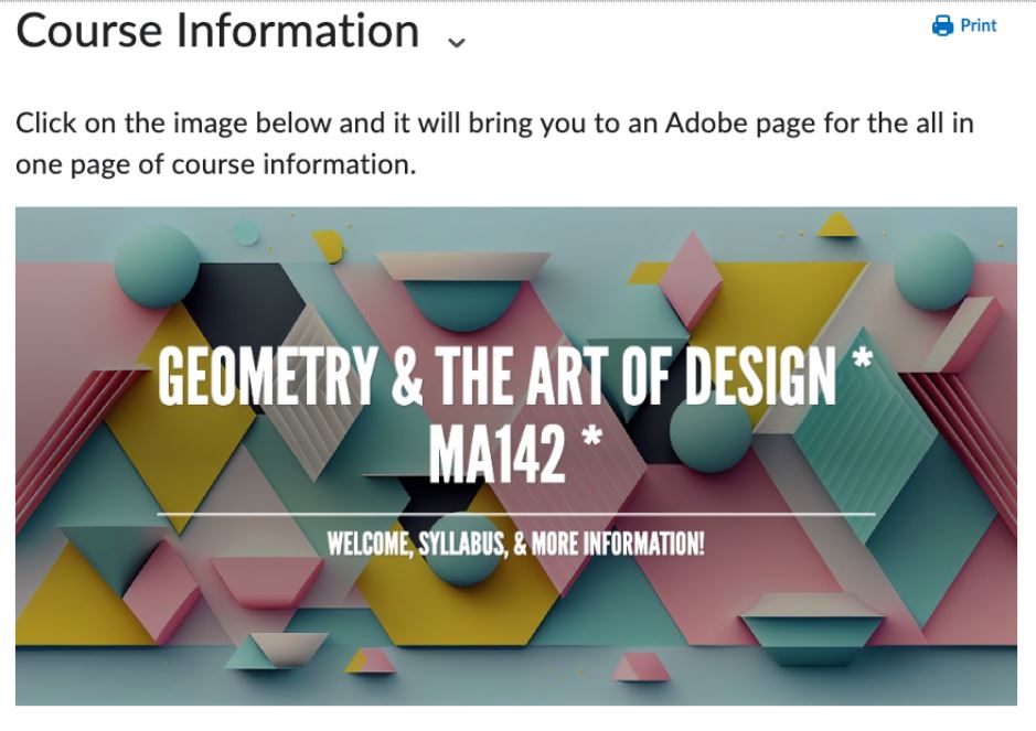
- I use the site for images that appear on top of the html pages of Brightspace. You can start creating banners or images quickly in Adobe Express by clicking on a few options, such as Social Media or Custom Size from their home page.
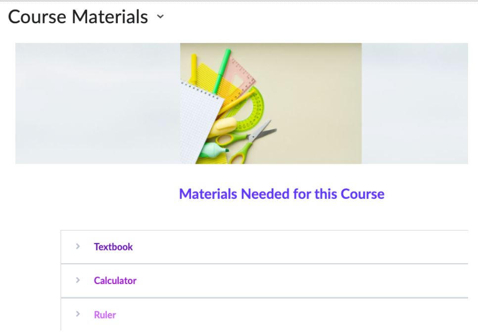
- I use Adobe Express for the images I put in the descriptions in Modules. Sometimes I spend a lot of time customizing images and adding elements (like the one below) and other instances I will choose a ready made option.

- I use the site to display images in my table of contents with a combination from Adobe Express web pages and images.
Last but not least let’s talk about the Table of Contents. Honestly I am still figuring out what works best for my courses. I don’t want to overwhelm my students by having too many items show up in this area; so, in most of my courses I have only around 6 or 7 items. I know that many instructors have all their units/modules in the table of contents and at some point I may switch to that view. For now these are what I have as my table of contents in at least two of my courses:
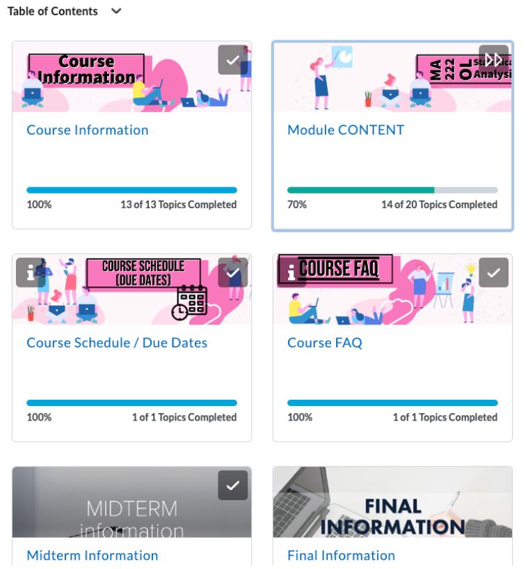
- Course Information – this is the top left of my table of contents. Students need to understand how the course works, my expectations, find the syllabus, and more.
- Module Content – this is the top right of my table of contents. This is where I have the content of the course: my lectures, assignments, and everything else. It is broken down into units/modules within this area. The units open up on specific dates.
- Course Schedule / Due Dates – this can be found in more than one location in my courses but I believe it is one of the most important parts of any class especially online ones that it needs to be a main focus in the table of contents. You will notice a little “i” icon on the banner. If/when a student clicks on the “i” it says: Due dates for the course. No late work accepted. All assignments due by 10 pm EST.
- Course FAQ – this is my frequently asked question blog linked to the table of contents. I mention the Course FAQ in all my announcements so students will hear about it at least 30 times a semester. Still I want students to be able to quickly find answers to any questions they may have. You will notice a little “i” icon on this banner too. If/when a student clicks on the “i” it says: Have a question? Want extra practice? Please first check in this Course FAQ that I have made for this course…
- Midterm Information – this is my first semester adding the exam information to a separate area in the table of contents. It used to stay inside the Module CONTENT area but since students tend to ask many questions about exams I believe they will like it in this spot. I have it available as soon as the course opens.
- Final Information (which remains hidden until the midterm) – I do have information about the midterm and final in the course information but these areas go in a lot of detail. They have the format of the exam, the length of time, the modality, the topics, a practice exam, solutions to the practice exam, and more.
- Project – for the course that has a project.
Did you choose a different table of contents? Do you have any Brightspace tips or tricks? Feel free to let me know: jennifer_shloming@fitnyc.edu
_______________________________

Jennifer Shloming is an Assistant Professor at the Fashion Institute of Technology and a 2019 SUNY Online Teaching Ambassador.
If you would like to be a guest author for the Online Teaching Hub, contact Erin Maney erin.maney@suny.edu.