
Adobe Express Pages
You may be thinking that you have enough to worry about right now so why start creating with a new tool?! Well, this tool is worth it, at least in my opinion.
Do you want to add some spark to the way your students view your course content?

If you are on this site, then I am sure the answer is of course! Well, with a couple extra minutes you could present your material in a more professional looking, interactive, personal, and simply amazing way. I truly love creating material using Web Pages from Adobe Express. I use Express Pages (formerly called Spark Pages) in every section of my online courses.
I embed Express Pages in my learning management system (LMS) and students have the option to make them full screen. One of the best features with Express Pages is that you can edit your pages and then click on update link. You don’t have to change anything on your course site!! I tend to change one thing or the other in my pages from semester to semester (like the midterm or final information page) and do not need to log in and go into LMS to make any changes. Embedding isn’t the only option, though. You can send out an email with your page directly from Adobe Express Pages or use a shareable link to post wherever you prefer. I always choose to embed but if a student asks to get ahead I am happy to send them a link with the next unit’s page.
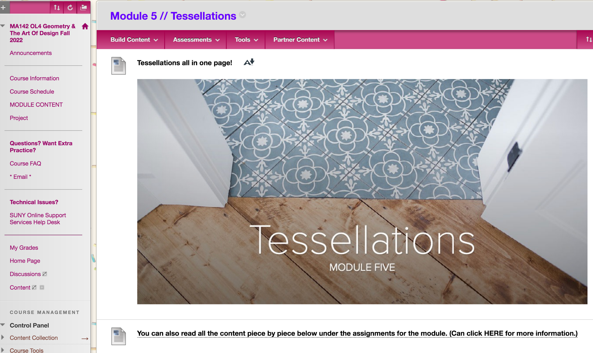
All my modules use Express pages. Students do have the option to click on them or go piece by piece on our LMS. While I believe these Express pages look awesome, maybe a student finds them daunting since there is a lot of information and scrolling on one Web Page. For this reason, I always give them the option in each unit to view based on their preference. At the top of the module I place the Express Page and have text that follows explaining they can also read all the information piece by piece below, in the same folder.
Here are some actual examples from some of my courses.
The above video is from an online statistics course.
Another Express Page Example – Watch Video
In the two videos above you can see how I use Express Pages (formerly Spark Pages) for my units. These are pages where students will scroll through a continuous page to see all the material. Each of my module pages have images, text, and links. In many I embed videos too.
If you look at these two videos again you may notice that you have options for these features. You can bold text, italicize text, have bullets, and have different sizes for the headings. While you have these choices there aren’t too many, which makes creating pages fun and quite fast. Since Express Pages allow for rapid and vast customizations even I can’t replicate my pages with the exact look and feel when I start from scratch! There is a duplicate button where you can have identical pages and then edit but I honestly enjoy building and designing these pages to have varying appearances based on the topic. Sometimes I use free images through the search button and with other topics I tend to upload my own artwork. I can’t imagine any Express web pages from two instructors ending up looking that similar when building from a blank template – even if the instructors are teaching the same course. The Express Pages end up having a personal feel especially due to the themes you pick and the pictures you choose.
In the second video (link) I point out images, videos, text, and links; and explain when I use buttons versus regular links and more. Links can be buttons or the typical blue inline you are used to seeing online. The buttons themselves can differ in style based on the theme you end up using for your page; my buttons are usually rectangular but can be ovals or another shape. In the image below you can see how I use links in each way in an Express Page. The button that says *** Midterm Topics/Terms *** is a link that will take my students to a Google Doc. I think of buttons as fancy links. You will notice that the other links are blue and are located where it says HERE. These also go to Google Docs.
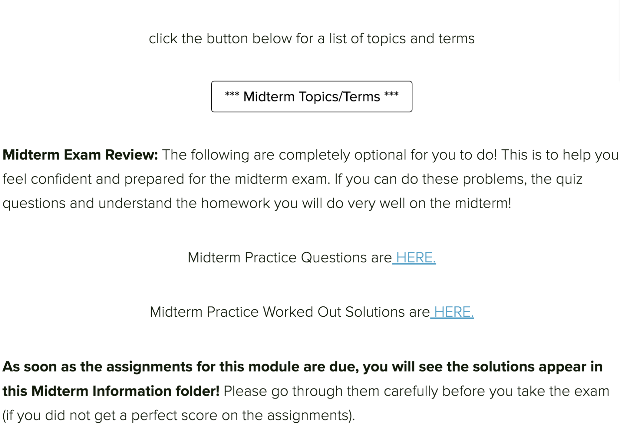
Image from an Express Page showing links used in two ways
You may be thinking that this is overwhelming right now! If so, keep in mind that I started by showing you longer pages that I use for students to interact with course material. In this example, I promise you will see a short page. I like to create these brief, simple pages with only links/buttons for my midterm and final exam information; how you decide to use pages is obviously up to you! These are just suggestions. You may not want to spend a lot of time choosing pictures and having long scrolling and always use shorter pages. Still, I would suggest you try at least one of each type and then go from there. Start with a basic page that is on one topic. I recommend an exam information page. Then once you get the hang of the basics move on to creating an Express Page that contains more material and has another layout involved, like a glideshow – my favorite feature.
By now I hope you are excited to start playing around with Adobe Express to create your first page! It is free to use and most school email accounts give you premium access. I would log in to Adobe express first through your institution to get the most options. If you don’t want to use your school’s account, that’s fine.
You can log in at https://www.adobe.com/express/.
From this link you will click on create your web page now. If you want to see some information from Adobe first, then scroll down a bit and look at the steps they have about how to create a web page.
Now you should see this page ready for you to work your magic:
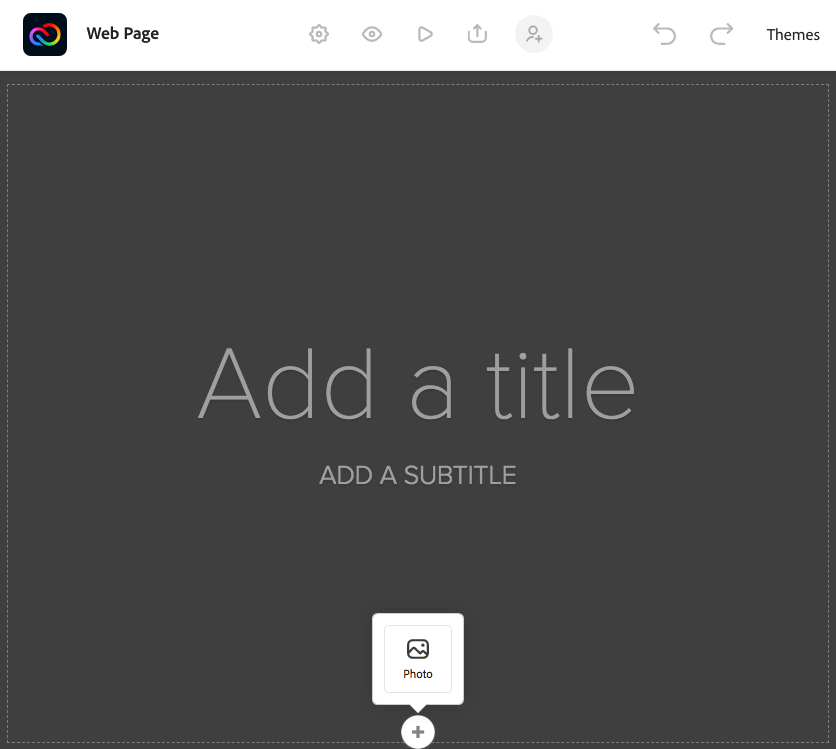
- Add any title and subtitle.
- Then add the background image.
- For now, please play around with the find free photos just so you see what is available to you!
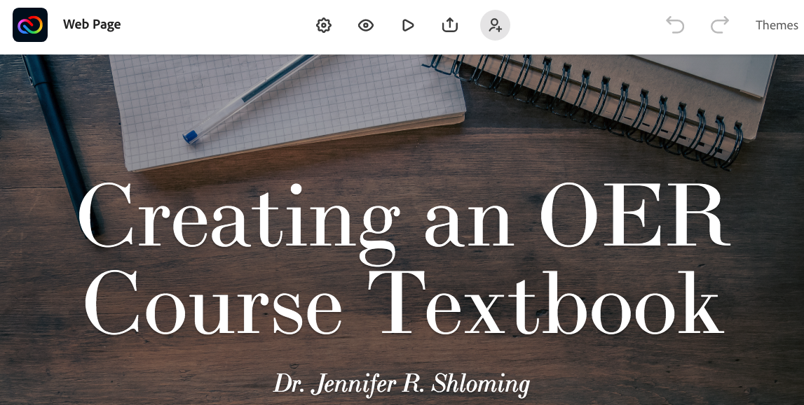
Above is what you should be seeing if you are using Express in 2022 and beyond.
Below I am including an image from 2021 so you can see what the icons mean!
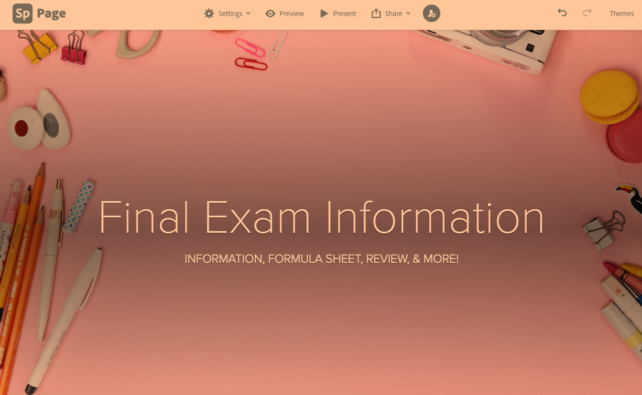
Now in the top right corner, click on Themes. Spend a few minutes looking through the themes but note that you can always change it while you are working on your page! Once you have a temporary theme that suits your style, it’s time for you to add more to your page. First try to make a simple page; like an information page with just text, link(s), and button(s) but it’s up to you. I recommend once you have a bit of content (especially if you are using a button) to check again on how your theme looks and if you want to switch. You are welcome to share your page with me if you would like me to see what you created!
Once you are satisfied with your page, it would be great for you to experiment with more options. As I mentioned before I do love the Glideshow feature. You can keep building on your first Express Page or begin another page. I highly recommend you click and explore the Glideshow after starting a new Web Page. This way you can have both kinds of pages in your account. You will be able to edit them later. You can also duplicate what you created if you do not want to start from scratch to build future pages.

I have included a video of me creating a page below to help if you want some extra guidance, suggestions, or ideas. I usually make these web pages for every chapter/unit of my course plus a course information page plus a midterm information page and you probably guessed it – I also make a final exam information page. I love to make Express Web Pages so much and think it is especially useful to have them for specific topics instead of one for the entire course.
Making the Pages – Watch Video
Now that you know how to create an Express Page the next step is to share with your students. I embed these pages in my learning management system (LMS) and students have the option to make them full screen. Embedding isn’t the only option. You can send out an email with your page directly from Adobe Express Pages or use a shareable link to post wherever you prefer. I always choose to embed but if a student asks to get ahead I am happy to send them a link with the next module’s page.
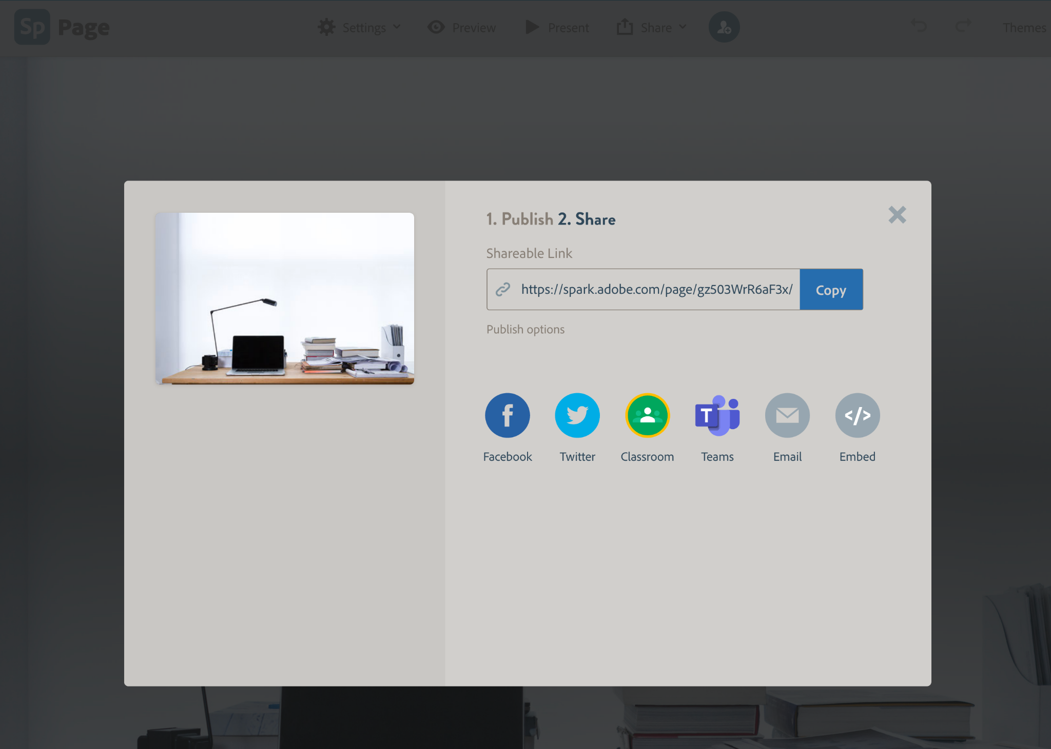
In the image above you can see the different options to share. They all may be straightforward to you but I will take a minute or two to explain how to embed. The embed option is all the way to the right. Make sure to click on the Embed instead of just copying the link.
I created a short video that goes over the steps to embed a page into your LMS or you can follow the step by step instructions after the video.
Source Code to Embed – Watch Video
- After you click on the Embed option from your Express page, go into your course site and pick where you want to have the page.
- Where you typically build content there should be a create item option, which you will click.
- Once it opens you click on the source code button. Below is an image of what the source code button looks like in Blackboard. It is the “< >” symbol and when you hover it will say “Source code”. I suggest you hover over the buttons to make sure you have the correct one before you click. Once you know you have the source code button click on it.

- You will then paste the embed code.
- Make sure to save the source code.
- Finally you will press submit.
I hope you felt how I much adore using Express Pages for my course content. I create a page for each course unit so that everything is in one place. I also create web pages for midterm information and for the final information. You can add photos, videos, and links, which means a page can handle whatever you want to show!
While I focused on how I use them to present material for my students I wanted to include some other ideas:
- You can ask students to create a page on a topic as an assignment! Students can focus on the research and still turn in a professional looking assignment.
- You can create a page about yourself (a project you are working on, a CV, an event you are planning or a completed activity you wish to feature).
- Same goes for a student – you can have a student create their own page showcasing their own work!
Adobe Express Pages are what gives my courses their look and feel. Do you use an amazing tool that adds some spark or pizazz to your course content? Or, do you have another idea on how to use an Express Page? I’d love to hear from you!
Feel free to message me [jennifer_shloming@fitnyc.edu].
Jennifer is a 2019 Open SUNY Online Teaching Ambassador.
If you would like to be a guest author for the Online Teaching Hub, contact Erin Maney.
ambassador, community, cool tool, instructional design, online teaching